The Lighter Side Of Graphic Design: 40+ Hilarious Fails Spotted In Everyday Items
Many people, including us, love to stop and admire a talented graphic designer’s handiwork. It’s not only fascinating to see what creative things they come up with, but you can also have a ball trying to spot their goofs. For example, if you study a product label or billboard long enough, you might notice something odd, like a typo or a funny quirk. And that’s precisely what this article is about.
The errors can range from tiny spelling mistakes to unfortunate placements of photos. Whoever hired these people was definitely not thrilled with the outcome. But at least we can appreciate the fact that they make for a good laugh! After you’ve scrolled through this list, we guarantee you’ll be itching to search for some design slip-ups. We hope you enjoy it!
Bathroom Mixup
You know how people get embarrassed when they pull a push door? Well, this is more awkward. A man entered the women’s bathroom at an airport because he read the sign wrong. It wasn’t his fault, though; it is pretty confusing.
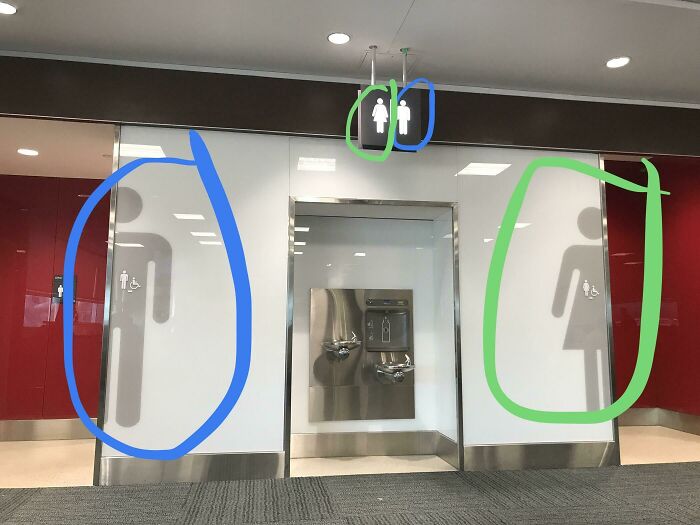
The poor guy experienced what we all fear most. He must’ve walked in and wondered why the bathroom had a feminine touch! Plus, the absence of urinals must have been quite startling. Hopefully, he was in there on his own.
Alphabet Remix
A, B, D, C, E, now they don’t know their ABCs. If this poster had been placed in a classroom, then these kids’ parents would be right to consider finding them another school. Since the alphabet is in the wrong order, there’s always a chance they might be taught to count incorrectly as well.
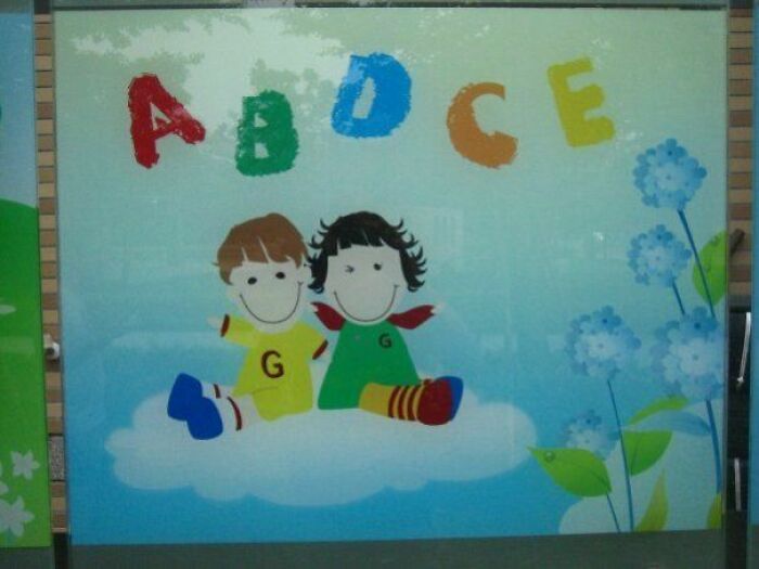
The creepy puppet kids on the poster have ‘Gs’ on their shirts, which could mean that there’s an ‘F’ on there somewhere. But don’t be tempted to search for the missing letter. It would be a huge waste of time.
Unique Crockery
This soup bowl design apparently wants people to break their soup. Most soup bowls have a photo or just the word soup on them, but whoever made this one thought it would be fun to add a weird yet unique design.
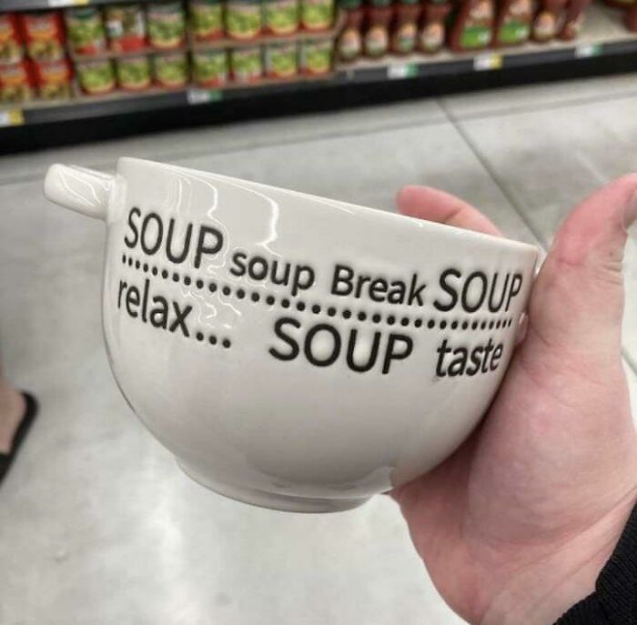
Most people usually enjoy some form of entertainment while they are having a meal, and this bowl certainly sorts that out. You can sit there and try to figure out what they were thinking when they settled for this design.
Honesty is the Best Policy
‘Zero taste’ sounds better suited for a bottle of water, not soda syrup. This label was most likely meant to say ‘zero sugar,’ and though we’re sure the syrup is very tasty, people who aren’t familiar with the brand aren’t going to be too keen on buying it.
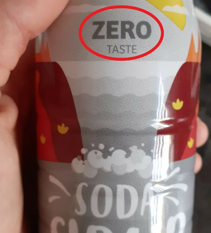
Because this drink is still on the market, we assume it indeed has a taste. No one would buy it if it didn’t. Or maybe they would; who knows? That said, it would be hysterical if it really didn’t taste like anything since they would be the first company to be honest about their product!
Orange Milk
There’s cow’s milk, chocolate milk, and now orange milk. As cool as that would sound, this was the result of an unfortunate accident. At least, that’s what we hope. You would be very confused when you go there looking for milk, only to discover this.
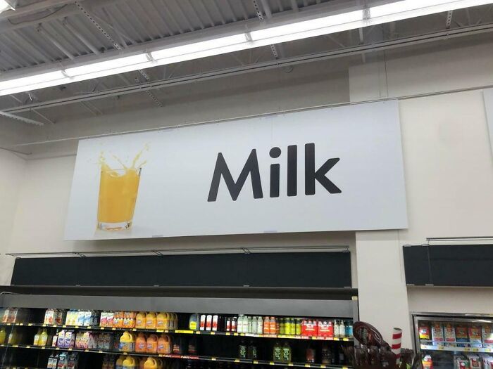
This banner is really weird and random. It’s not like the internet ran out of images of milk or that the word juice couldn’t fit there. Since this is clearly the juice aisle, we wonder why the word ‘milk’ is still there.
Snow White and the Poison Apple
“Snow White” seems like a wonderful character to put on a bag of apples for children until you remember that she was poisoned by one in the movie. It’s very normal to see popular characters on snacks and fruit, but this was definitely a problematic choice.
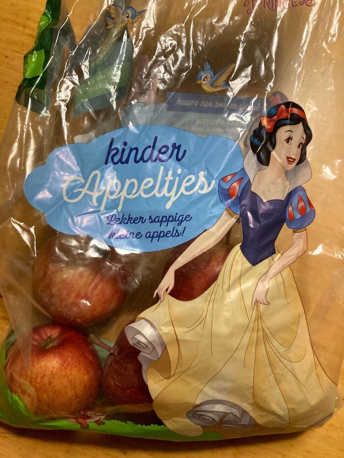
Kids tend to pick things with their favorite characters on them. But this company should have picked someone like “Cinderella,” who didn’t have any near-death experiences thanks to an apple. This is just the kind of design fail we live for!
International Cuisine
These pictures went from bad to worse. The first one reads ‘baguette.’ which isn’t actually the name of the bread in the photo, the pizza doesn’t look very appetizing, the third one says China when it’s meant to be rice, and the last one says salat which would only be correct in German!
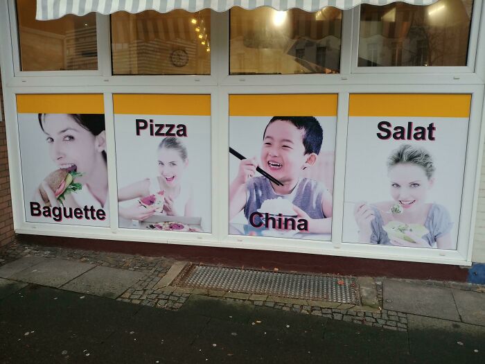
Assuming this was spotted in a non-English-speaking country to attract tourists, it would have the opposite effect. Instead of using stock photos, they should have hired someone to snap some pics of their own dishes and redo the text. So simple, yet they couldn’t do it.
Bewildering Banner
This brand needs to create a different banner. The red is eye-catching; we’ll give them that. However, it’s difficult to read. It would be very distracting to have this displayed on a busy road since people would try to make out what it says while driving, which is dangerous.
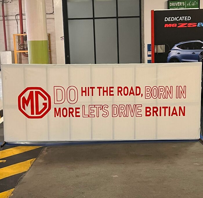
“Do hit the road, born in more let’s drive Britain.” No, that doesn’t sound right. Oh, it’s probably meant to say, “Do more, hit the road, let’s drive, born in Britain.” Also, not how ‘Britain’ is spelled here? These guys are lucky they weren’t summoned by the Queen!
Ominous Sign
This hairdresser cuts people for an affordable price. Don’t worry; judging by the pictures, it’s just hair that they’re cutting. Hopefully! They really should have added the word ‘hair’ to the ends of those sentences because, without it, the advertisement sounds threatening. The last photo also doesn’t help.
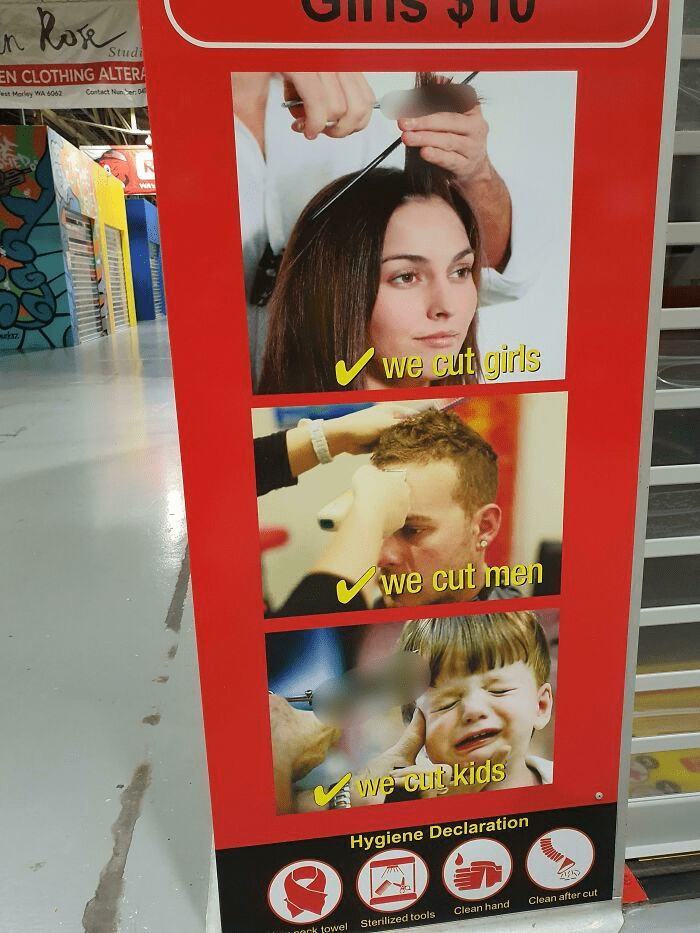
We understand that it could be challenging to get a photo of a toddler getting their hair trimmed without them crying, but this looks especially bad because of the “we cut kids” signage written below. But at least we know their salon is sanitary, thanks to the hygiene declaration!
They Had One Job
If you wanted to replace a letter in the word ‘sport’ with a soccer ball, where would you put it? It would be best to place the ball on the ‘o,’ right? However, someone decided to replace the letter ‘p’ instead, so now it looks like it’ says ‘soort.’
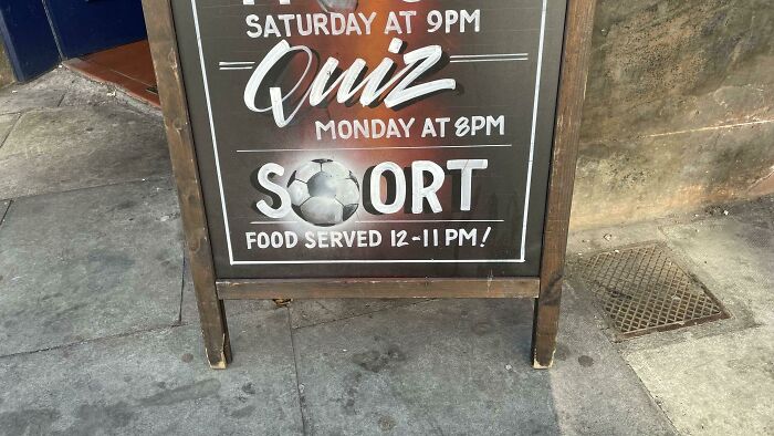
This person had one job, but they still managed to mess it up. If we were the ones who had hired them, there’s no way they’d get paid. Though you can still make out what they were trying to say, it’s still frustrating. We hope everyone enjoys the soort; we mean sport.
Puzzling Design
This sign got one thing right; coffee and doughnuts go great together. But the problem here is that the puzzle pieces don’t fit, so they’re basically contradicting what they’re saying. This has all the signs of an in-house design since there’s no way a professional would present this to a client.
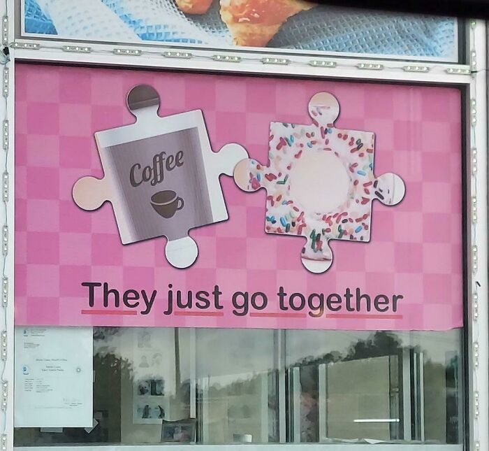
The background obviously stands out, but that’s not what people need to be focusing on. It’s the coffee and doughnuts that should be center stage. Also, no one would be able to tell what it is from a distance since the images are cropped. All in all, this was a terrible idea.
Trashy Sign
“Trash employees only.” That’s quite insulting. This is what happens when businesses skimp on things. A sign like this could either give the employees a good laugh or make them feel terrible about themselves every time they enter the room.
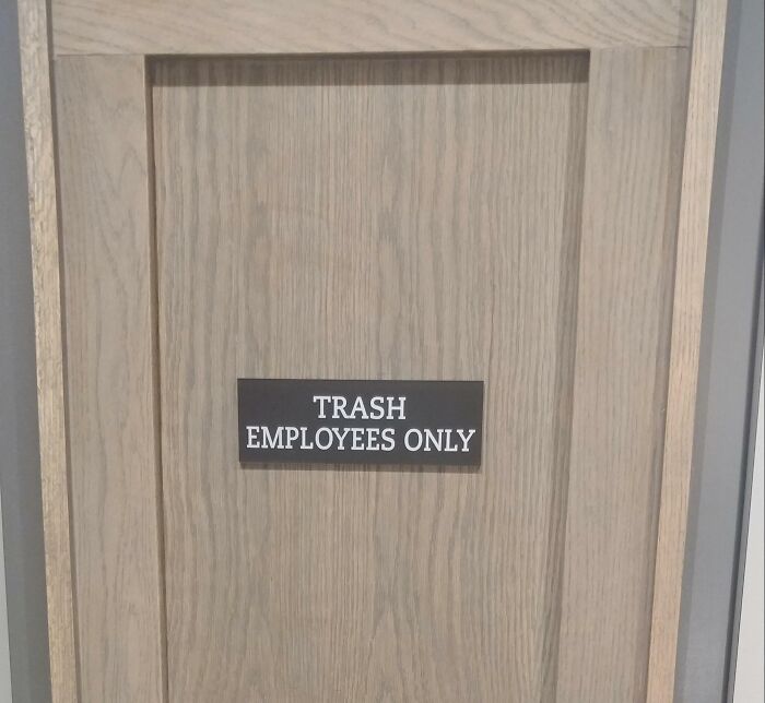
Didn’t the person who made this sign realize what it sounded like? A rushed job is the only thing that can explain someone missing this egregious error. Either that or this workplace has some kind of strange detention room for naughty employees!
Something’s Missing
Everyone should wear a pair of socks to keep their feet nice and toasty, including this model. Though she’s stunning, this wasn’t the greatest tag to encourage people to buy these socks. She looks perfectly happy without them! Additionally, ten euros sounds like a lot for foot warmers.
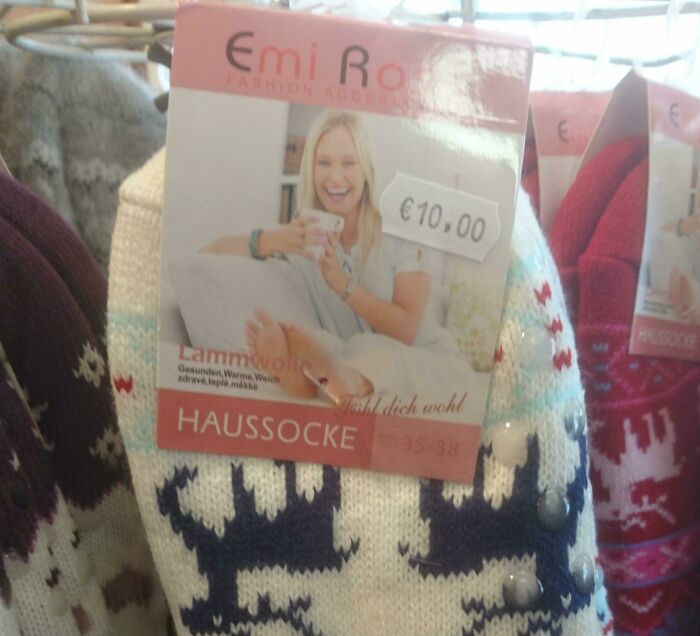
These guys should invest in a different marketing strategy. If they can’t get someone to model the socks for them, a drawing would suffice. Or they could just forego the whole picture since socks aren’t like other items of clothing where you need to see what they look like on.
Pure Puke
This business got the placement of the bowl right, unlike the soccer ball one, but it’s still bad because it looks like it says ‘pure puke.’ Gross! That’s not what you want customers to think of before they walk into your restaurant. They’ll definitely lose their appetite!
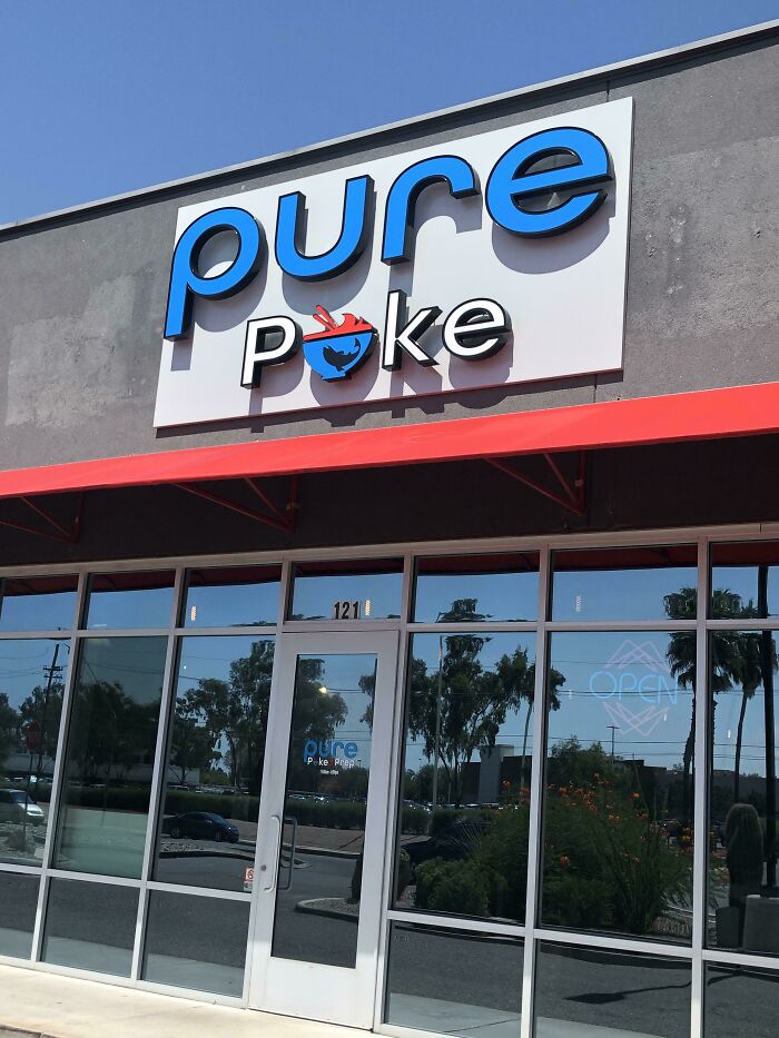
Aside from the whole ‘puke’ mishap, the sign itself is stunning. The building also looks amazing, so the design flop is a huge disappointment. That said, if they serve delicious dishes, we know people would look past the tragic sign and still go inside.
Feminine Hygiene Vibes
Something seems off with this box of noodle soup mix. First of all, the color and style resemble the packaging of feminine hygiene products. This mix is also usually packaged in red or green paper, so this was a first.
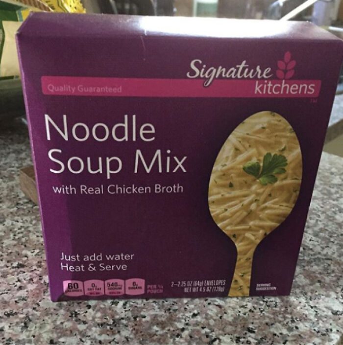
Place this box next to sanitary towels, and we guarantee someone will grab it without a second thought, especially if they are in a hurry. We wonder why nobody spotted this when the company was picking the design. Even the font gives off feminine hygiene vibes!
One, Two, Skip a Few
This message was probably an attempt to promote a healthy mindset of focusing on one problem at a time so students don’t feel overwhelmed. You know how tough school can be. However, the picture they used does not convey the same message.
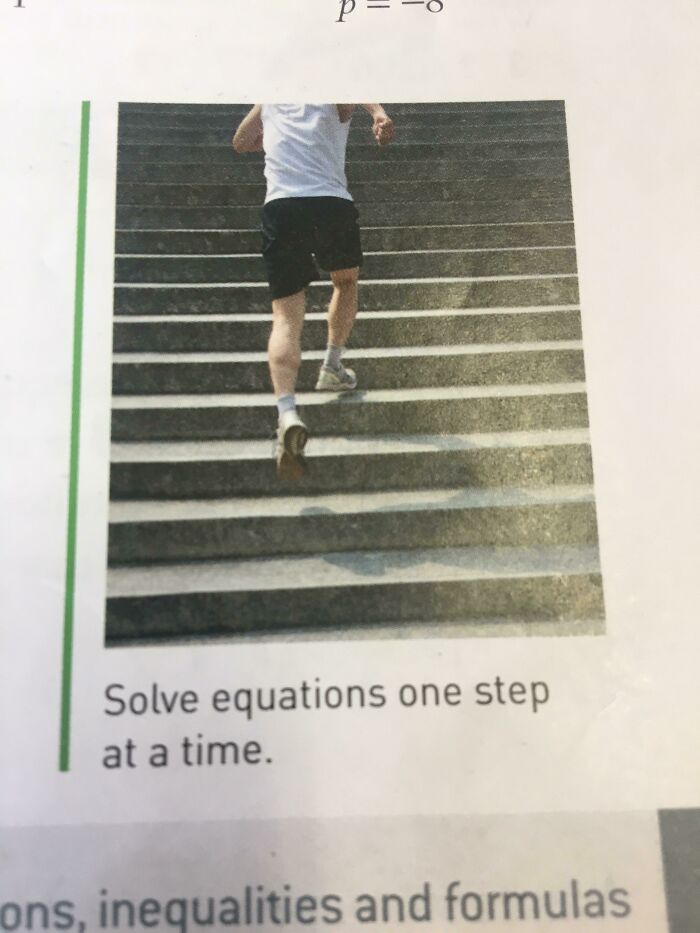
In the picture, the man is clearly taking two steps at a time. So in a way, it’s saying that it’s ok to take the easy way out and skip a few steps of the equation. Unfortunately, if you know anything about equations, you know this is a sure way to get stuck.
Not in Use
At first glance, this looks like gibberish, but it actually says “not in use.” Harlow Solid Italic font is so difficult to read when it’s all in capital letters. The only word here that’s easy to make out is “use.”
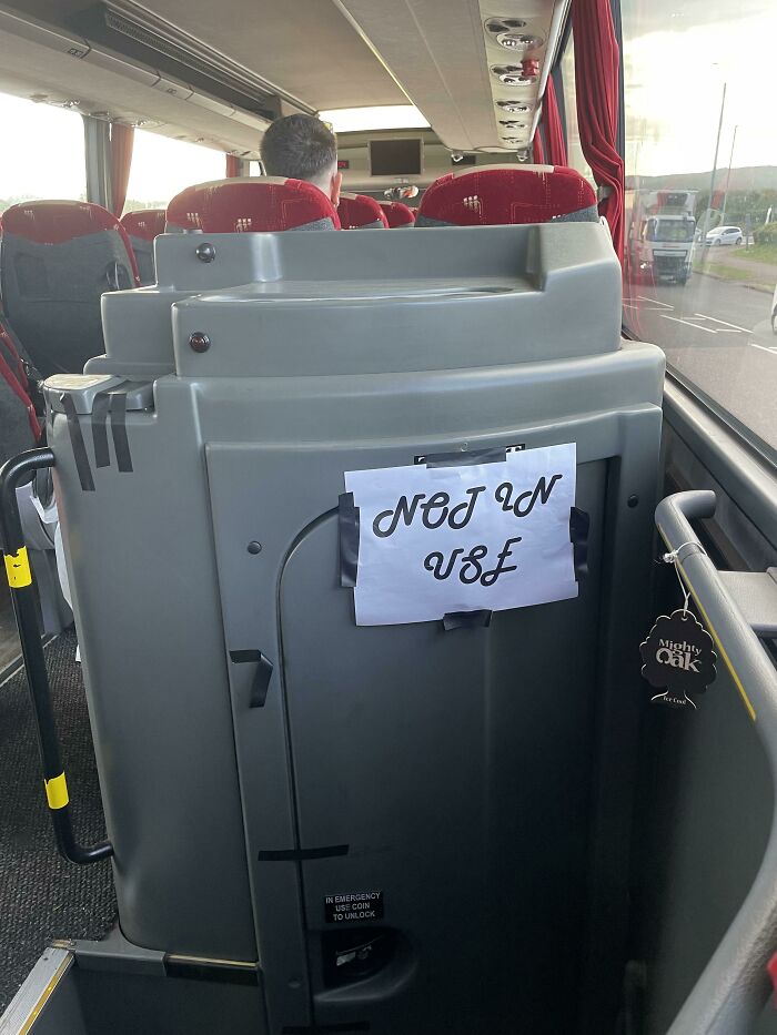
They wanted to make the sign look fancy, but instead, they ended up confusing everyone on the bus and the internet. People who needed to use the toilet had to stand there for a few minutes trying to figure out what it says.
Forbidden Gummy Bears
This person’s toddler probably thinks their parent is hiding candy from them. If you buy this and you have a child in the house, you must not leave it anywhere, or you might have to deal with a mouthful of scented wax.
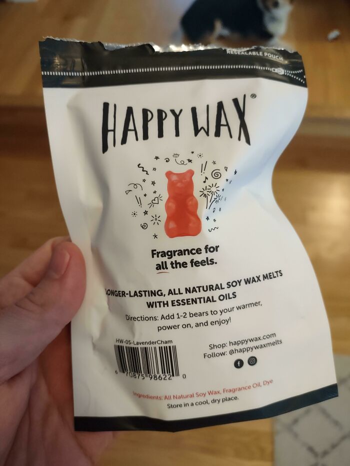
In 2004 Jessica Simpson released a line of edible beauty products that included body creams and fragrances called Dessert. However, this is definitely not edible like her products. It might look like sweets, but it definitely won’t taste like it. Too bad kids don’t know the difference until they taste it.
Shocker
Offensive language is usually frowned upon in magazine articles. However, this writer didn’t intentionally include a bad word. The drop capital letters spelled out something that is British slang for idiot. Before publication, an editor usually reads through the text, so we’re surprised no one noticed this.
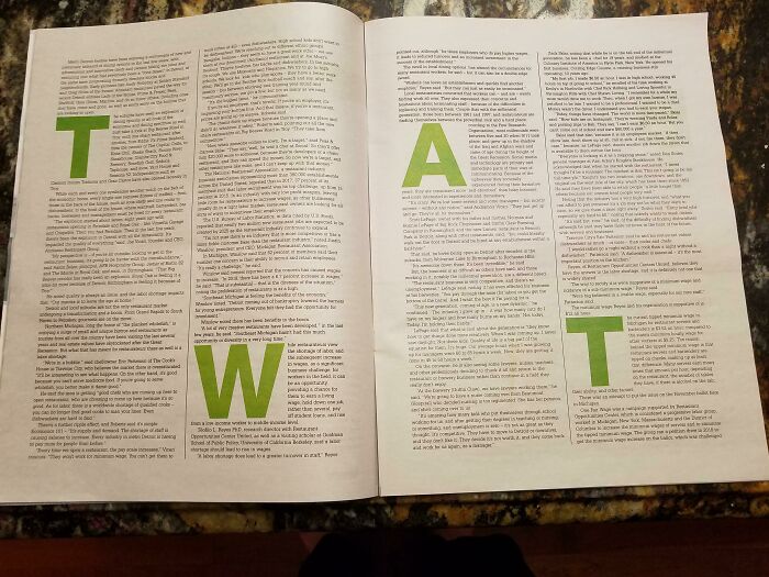
Readers must have really gotten a kick out of this. We wonder how many managed to get through this whole article without a laughing fit! After this blunder, we are certain they will be triple checking their work before publishing. Thank heavens it didn’t spell out something worse!
Total Transformation
This is a perfect example of faked before and after pictures. It’s clear as day that these are two completely different fans. The advertisement states that the product can clean things and supposedly transform them into brand-new objects. Very suspicious from the get-go.
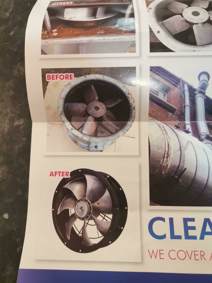
The image on the top right-hand corner looks like it would be the main fan’s “after” picture. However, the incorrect placement of the pics makes it look like false advertising. Would you still buy this cleaning product after seeing this?
Jump Scare
Ahh! We apologize for the jump scare. This advertisement is quite spine-chilling. If they wanted to grab our attention, it’s safe to say they were successful. The green grass monster man is pretty terrifying! Where are his eyes and mouth?
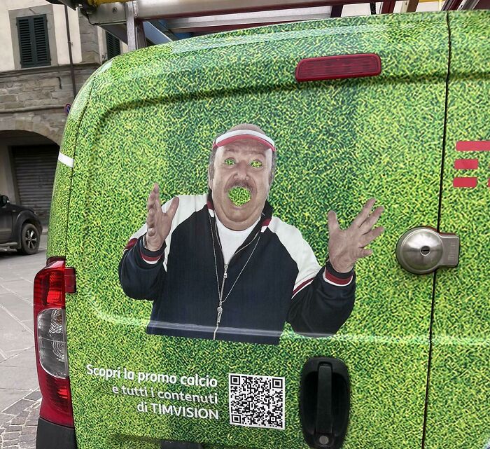
With this horrifying image, they got the perfect model for their advertisement. Thanks to their decision to post it on the internet, we are now all aware of the company, which worked out for them. As we all know, there’s no such thing as bad publicity.
Oversized Sweater
This is a lovely sign, don’t you think? A very lucky person gets to see this every day outside their house. How lucky! Jokes aside, this signboard kinda makes you think of when your mom promised you that you would grow into your clothes!
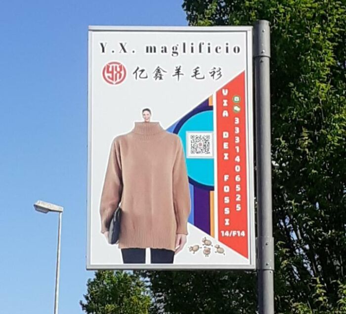
We can’t get over how funny it is. It will be a sad day when it’s eventually taken down. The tiny head and the oversized sweater are probably distracting to drivers, so maybe it would be safer for the advert to be removed or at least fixed.
Free Coffee At a Price
Free coffee? Yes, please! Oh, wait a second, it actually costs one dollar. It’s very mean to get people excited over free caffeine only to let them down. That said, some people might argue that they’re almost giving it away for free by only charging a dollar.
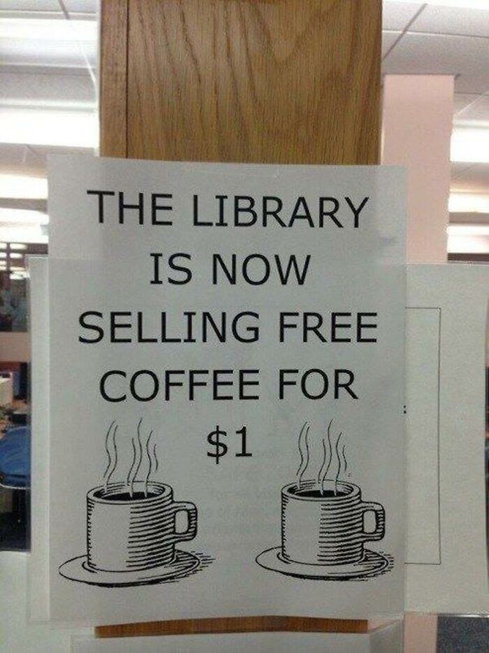
This library should at least give free refills to compensate for false advertising. Another school of thought is that the coffee is free, but they are charging for the cup. If that was the case, we know some brilliant bookworms would bring their own flask and go crazy!
So Close
How does one cope with stress? You eat dessert. That’s why this tagline that goes ‘stressed’ backward spells ‘desserts’ works in most ice cream shops. Stress, on the other hand, is sserts. This establishment was so close to getting it right. They just needed two more letters, and they’d be golden.
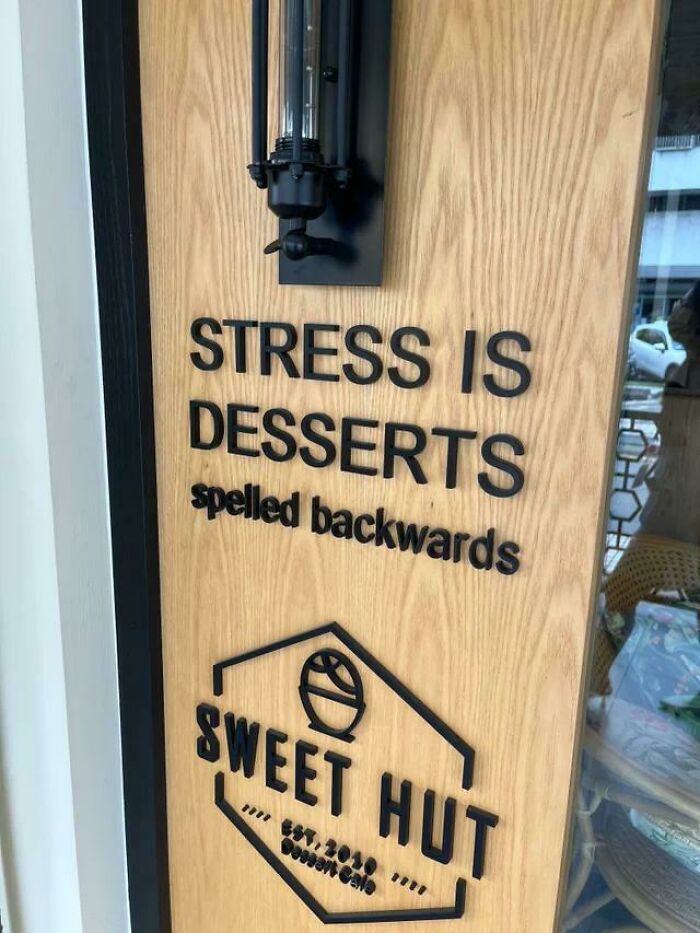
They might have chosen to ditch the two letters because a) it would cost less, and b) the rest of the wording wouldn’t be aligned. Maybe they figured people would be too focused on buying the candy to notice this error. Clearly, they were wrong.
We Love Nev York
This mug’s design included bold letters from different cities to spell out the word ‘love.’ However, they couldn’t find one with ‘v’ as its third letter, so they got the next best thing. They settled on New York and highlighted one part of the ‘w.’ Needless to say, it looks quite weird.
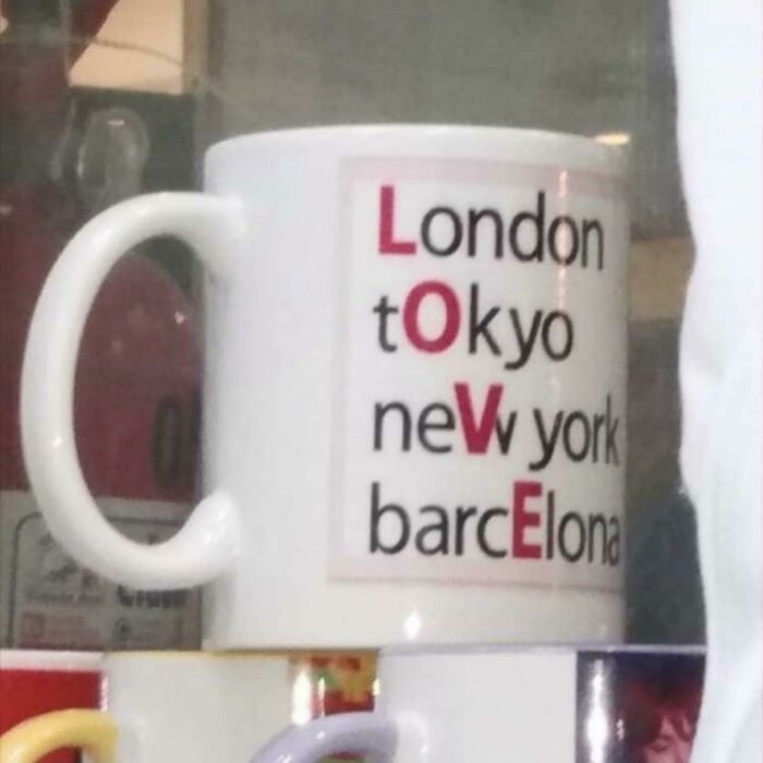
Havana would have made more sense. We admit that the letter ‘w’ does look like two ‘v’s put together, but it didn’t work as well as they had hoped it would. We really pity whoever paid to have this made because the result was a big disappointment.
Hilarious Handles
Though some may say these handles were placed this way accidentally, we think it was definitely done on purpose. We wouldn’t want to be the face of this advertisement; it’s so embarrassing. Now it will feel very awkward every time someone opens the truck unless they have a wicked sense of humor.
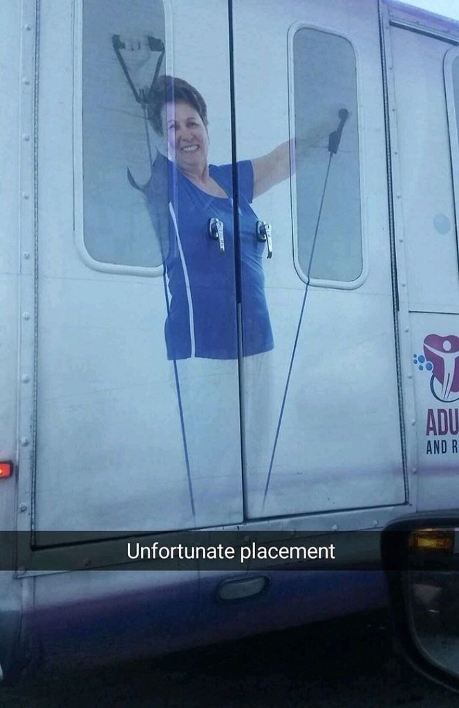
The position of the handles can’t be changed, but the photo can be repositioned or even removed. However, something tells us that the owner wouldn’t want to go to all that trouble. They probably thought it was so funny when they first saw it.
Artsy-Fartsy
‘Fine fart’ is a unique statement to put on a watercolor set. This was definitely meant to read, ‘Fine Art.’ We see what the designer was going for with the bold letter ‘F,’ but they should have considered its placement first.
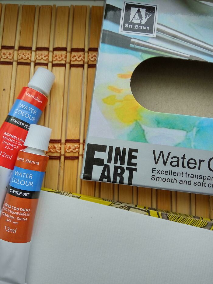
Artists normally pay great attention to detail, so they will spot this in a second. But even if you don’t dabble in the arts, this mistake is hard to miss. ‘Fart’ isn’t a word that you would want to be associated with your brand’s description.
Brain Freeze!
So apparently, we have all been eating ice cream wrong. You’re supposed to bite into the side, wrapper and all! We wouldn’t recommend you do this, though, especially if you have sensitive teeth. It would cause a major brain freeze!
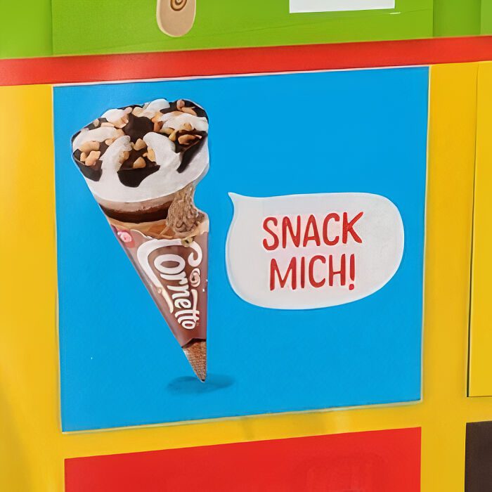
We get that the ad is supposed to show us the flavor inside. The bite was also probably meant to be the ice cream’s mouth since the speech bubble is right next to it. That said, all we can think about is the savage way the ice cream was eaten.
Camping At its Finest
Are you tired of your magazine or book getting dirty while you’re out? Buy this camper mat today. You can place your reading material there while you lay on the ground next to it like this dude. It’s nice to see someone putting their book’s needs before their own!
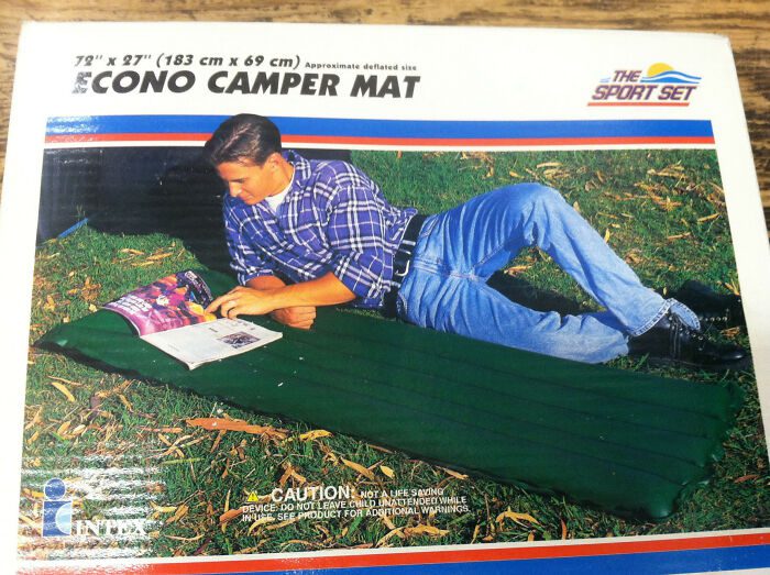
The model probably isn’t lying on the mat because they wanted everyone to see it properly. But what they should’ve done is take two photos; one of the guy lazing on it and another of the camper mat without anyone or any magazine. That way, it wouldn’t look so weird.
Yoda English
Looks like “Yoda” from Star Wars has secured a job as a graphic designer. It doesn’t matter what order you try to read this in; it just doesn’t make sense. It sounds like they want people to hit themselves on the third floor and thank them.
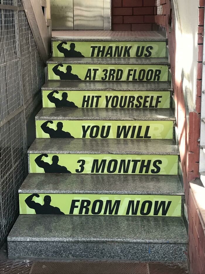
This gym is trying to motivate people to exercise. However, we think they steered them toward the library instead. Anyone who reads this is going to want to hit the books and make sure their English isn’t as bad as this!
Invisible Knives
Wow, invisible knives! These guys forgot to include knives on a box that says ‘kitchen knife set.’ How reckless of them. Consumers will be wondering whether they are purchasing a faucet or vegetables if they don’t read the box contents.
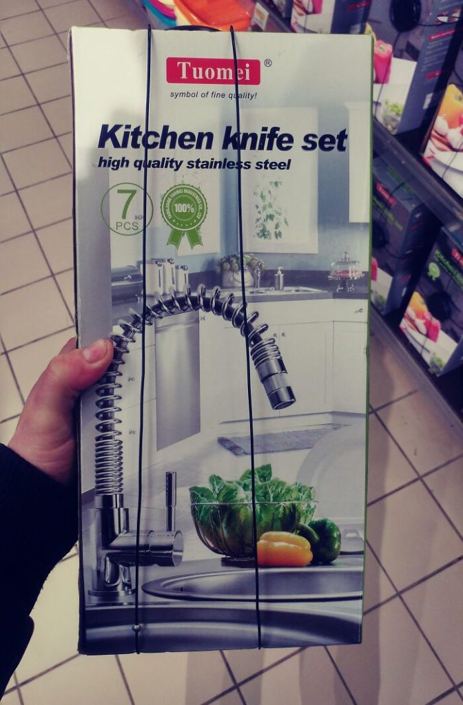
Seeing is believing, so how can we trust that there will be a set of knives in there? They’re advertising high-quality stainless steel, but the only stainless steel item we see is the tap. Since you can’t open the box, you can’t even verify their claim.
A+ Play Mat Design
We love this play mat’s cute design and the adorable bunny, but it should be more accurate. Someone bought this for their baby brother, and the poor kid will probably grow up thinking carrots are radishes since he’s exposed to this image on a daily basis.
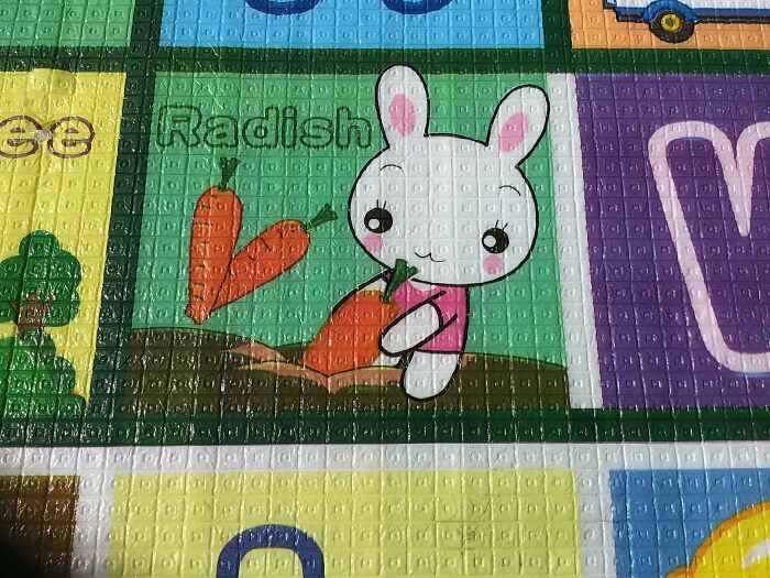
Bunnies do munch on radishes, so we can give them points for that. They are shaped like carrots but are usually white. Whenever you buy kids learning aids, it is best to ensure that what’s written on them is correct.
Geographical Error
Someone didn’t pay attention in Geography class. If this is what they learned in school, then their educators failed them. They should at least know the correct spelling of the Arctic Ocean. Good thing this was spotted in a coffee shop, not a classroom.
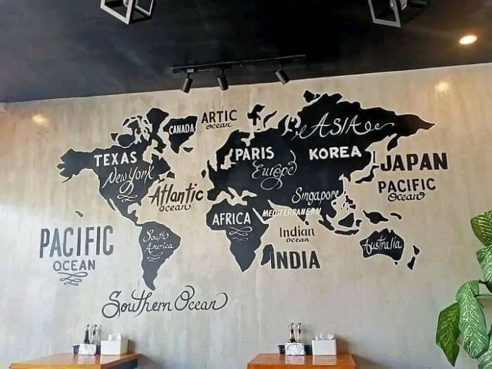
Have you ever seen those videos on YouTube where they stop people on the street and ask them where different countries are located? Ninety percent of people can’t answer most of the simplest questions. If you don’t want that to be you, get acquainted with a map!
Counting Caterpillars
It’s important for kids to learn how to count from an early age. That’s why it’s a good idea to give them a numbers book for them to practice. But preferably one that is error-free. This book says that they’re seven caterpillars, but we can spot eight.
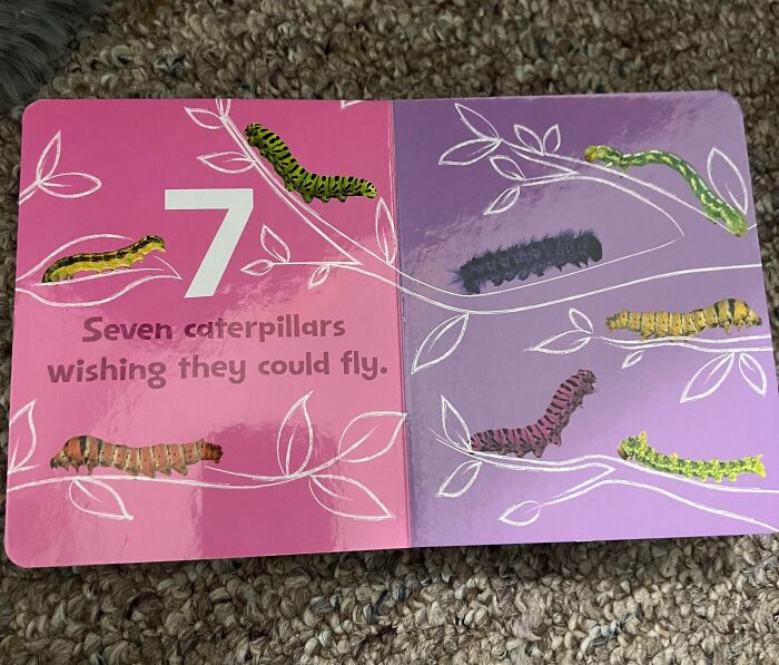
Since it says, “seven caterpillars wishing they could fly,” maybe it means one doesn’t want to! If we were to guess, we’d say it’s the one at the top since it resembles an inchworm that turns into a moth. So it’s assured of spreading its wings someday.
Wishful Thinking
From a distance, this sign looks like it says, “I want to be my dog I am.” We honestly think that most people would find this relatable. Anyone would trade lives with their dogs in a heartbeat. They sleep all day and don’t have to pay rent!
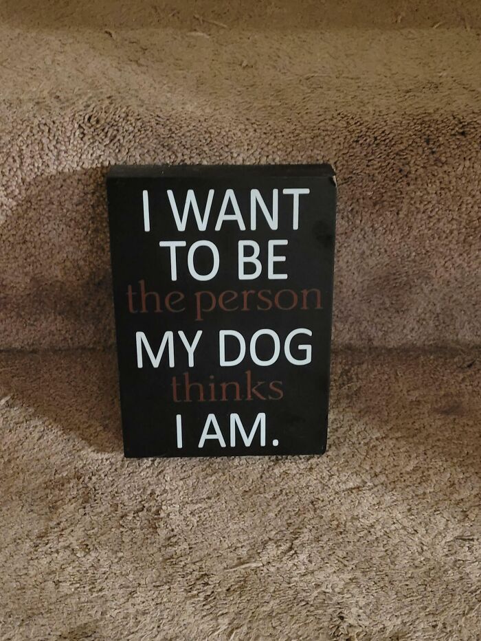
Despite the design fail, we think people would still be happy to buy this for their home. The color of the letters wasn’t the best choice, but with a few corrections, we are certain this would be something every pet owner would be proud to own.
Color Confusion
Here we have two boxes of butter. The unsalted butter is packaged in a blue box with red wrapping, while the salted butter is packaged in a red box with blue wrapping. Why they didn’t match the wrapper’s color to the box is a mystery, but it’s not really an issue since they’ve labeled them.
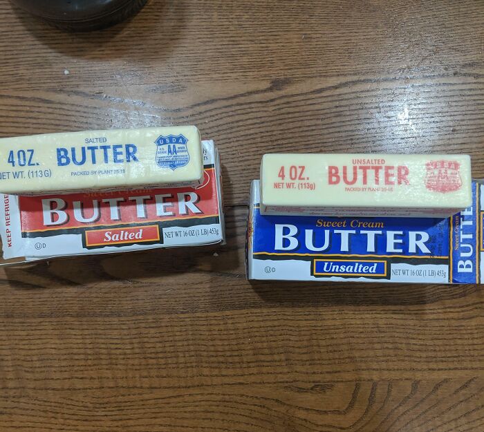
This person doesn’t need to have two boxes of butter in their home. Though they live with a roommate that prefers salted butter, they can purchase the unsalted one and add salt to it. This way, they’ll save money and won’t be confused by the packaging.
Don’t Look Directly At It
This is a Christmas card that someone received. It appears their friend wanted to gift them a headache for Christmas. If you didn’t have a migraine before, you’ll probably have one after looking at this. It’s like an eclipse. Don’t look directly at it, or you’ll damage your eyes.
The person who made this works in the printing industry. Umm, it might be time for them to find a new profession. Though it’s a sweet gesture, nowadays, you don’t need to give someone a card. At least not one that looks like this! You can always send a text.
Air For Sale
You can now buy air for only £1.90! This fish and chips menu says that you can get chips and select without chips for that amount or chips with chips for an extra £2.40. We know that sounds very confusing, so just read the menu yourself to understand.
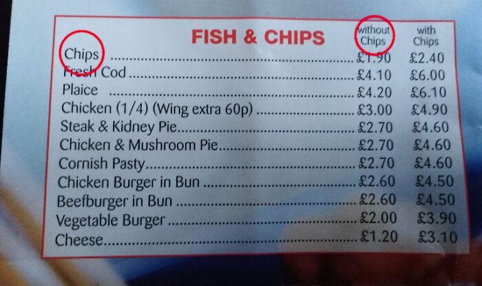
They also have cheese on their menu that you can have with chips or without. So if you select ‘without chips,’ we wonder if they will just give you a slice of cheese for £1.20 or maybe a cup of cheese sauce.
Two Ticks
Can’t figure out what this sign is meant for? Well, we don’t blame you. This company didn’t do a very good job of explaining. They could have written a short text so people wouldn’t be confused. But don’t worry; we’re here to let you know what it’s for.
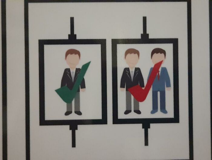
This is a sign that was put up during the pandemic to encourage social distancing and indicate that it’s safer for one person to be in the elevator at a time. They were supposed to use a red cross instead of a checkmark.
Not-so-great Graph
Someone found a not-so-great graph in their high school yearbook. First, it should’ve been a pie chart and not a Venn diagram. Also, the percentages are in the wrong circles, and the person answered yes and no to a question that doesn’t require a yes or no answer.
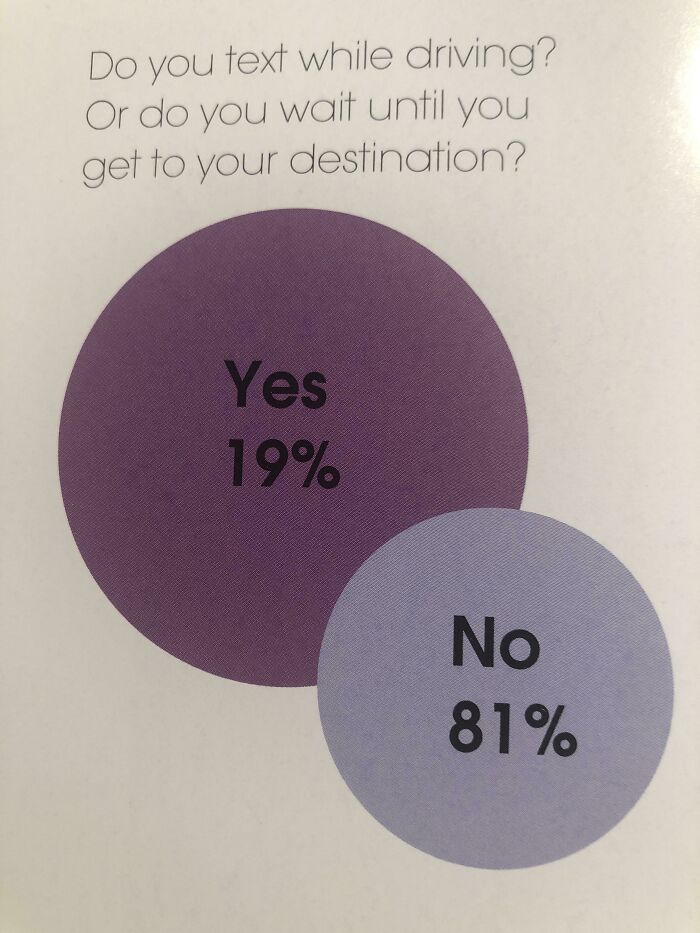
We can already picture their math teacher reading this and shaking their head. Whoever made this also failed to mention how many people participated in the survey, so the percentages could be made up. If they’re not, we really hope the 81 percent are people who don’t text and drive.
It’s a Christmas Miracle
The First Leon is a children’s Christmas musical that tells the tale of a boy who wanted to spread the true meaning of Christmas after discovering his name spelled ‘Noel’ backward. The chorus book was illustrated in a way to include both names on the cover. But there’s one problem; mirrors don’t work like that.
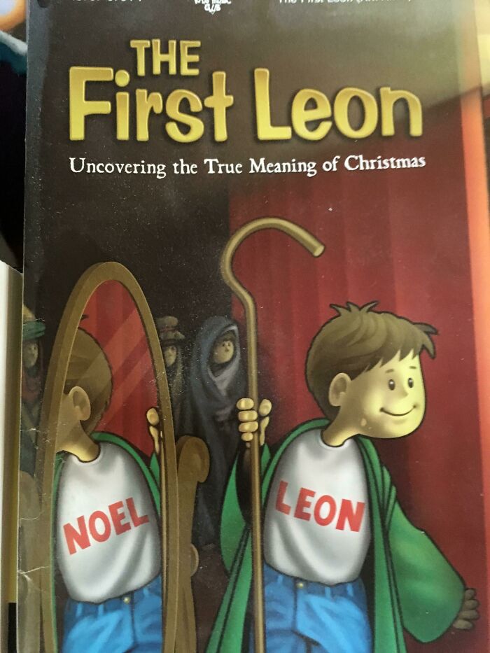
A mirror would reflect the word as ‘ИОƎ⅃,’ not ‘NOEL.’ This design isn’t the biggest flop on this list, though. If you’re into science, maybe you’ll see this as a major fail, but if you can ignore it, then it’s not that big of a deal.
Wrong Choice
Designers seem to really enjoy slapping the word love onto objects, especially mugs. You’ll find that they typically replace the letter ‘O’ with a heart or a different image like this one here. However, we’d probably prefer it if this map didn’t replace ‘O’here.
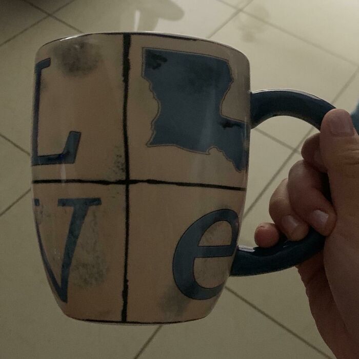
Louisiana doesn’t have the shape of an ‘O.’ It actually looks more like the letter ‘L.’ If designers’ hearts are set on creating a “LOVE ” mug where they replace the letter ‘O,’ then they should stick to the heart design.
Mixed Materials
What on earth is this jacket made of? It has three different percentages of polyester, which is rather baffling. You would think they would indicate the polyester as one percentage, but no, they wanted to leave us guessing. Well, they succeeded.
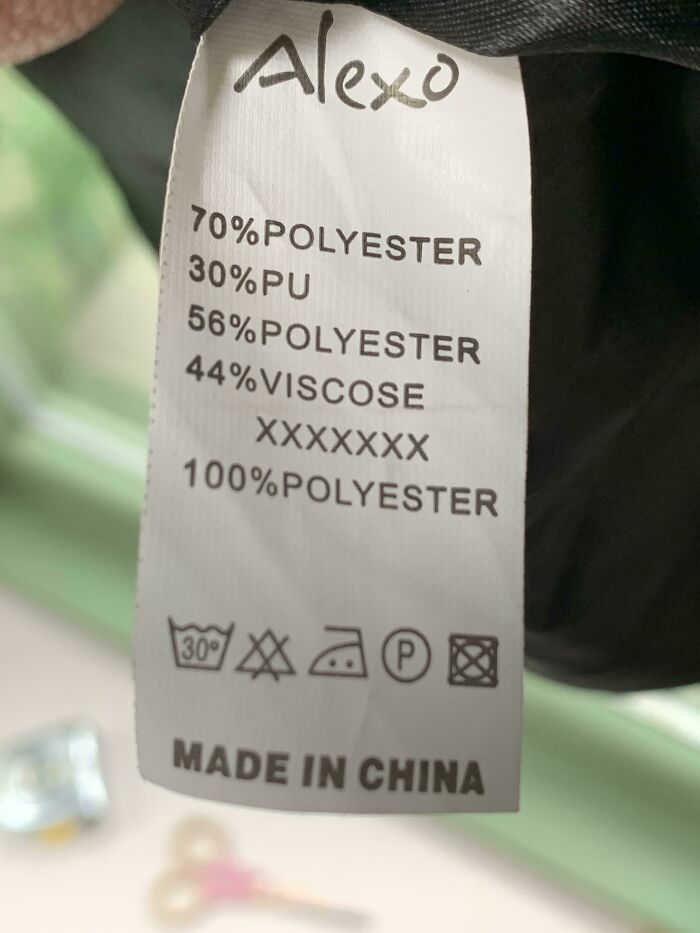
The label also mentions that the jacket was made with 30 percent PU which stands for Polyurethane. It’s added to garments to make them more durable, but it’s not very environmentally friendly. Quite honestly, we know everyone would prefer 100 percent organic cotton.
Welcome Exit Sign
This restaurant has a welcome sign right above the ‘exit-only’ sign. What’s really hilarious is that below where it says ‘welcome,’ and above the ‘exit,’ it also says ‘we’re glad you’re here.’ It sounds like they’re glad you’re leaving the restaurant.
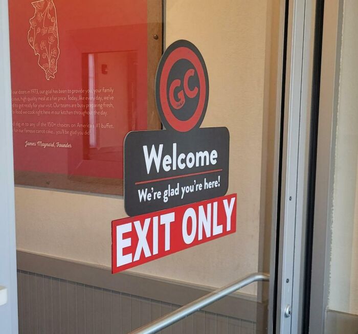
This error would be easy as pie to fix. All they need to do is remove the welcome sign, move it to the correct entrance, and voila! Customers can just waltz right into the restaurant and enjoy their delicious meal without going through the confusion that is this door.
Mixed Signals
Who knew a sign in a café could give you mixed signals? It says they’re closed, but it also says come in. The other side probably says something along the lines of, “sorry, we’re open.” There’s actually a restaurant that has a sign just like that.
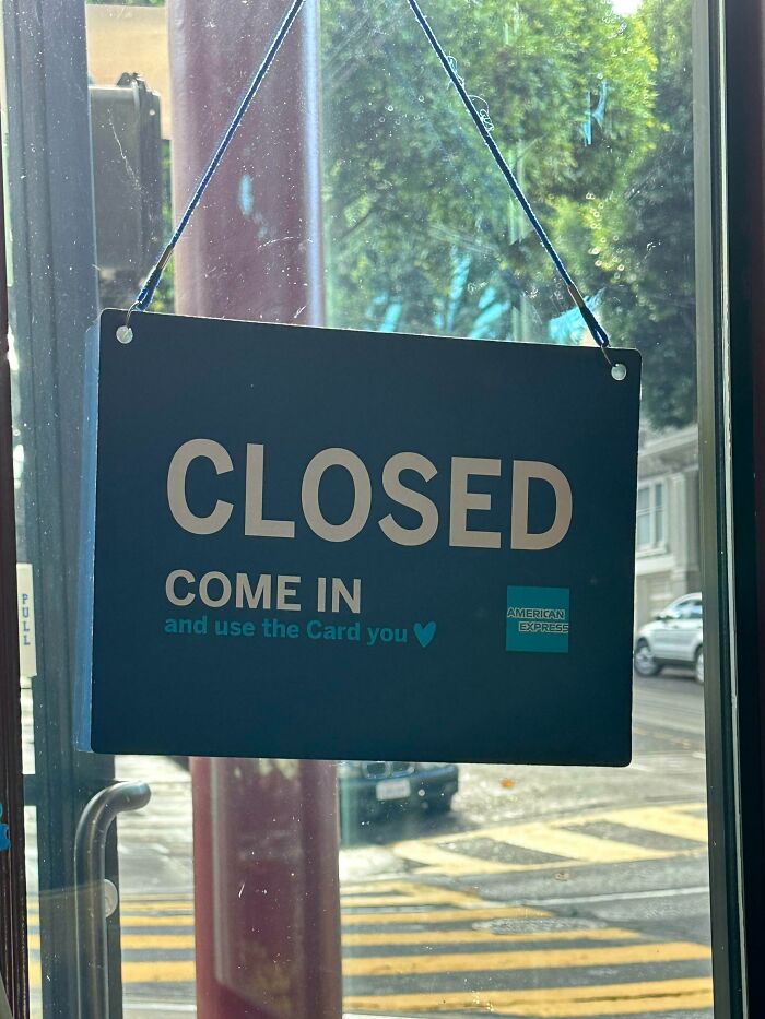
They’re probably a ton of people who tried to open the door while they were closed, therefore making it look as if they’re breaking and entering. Though you would immediately read ‘closed’ from afar, you would be forgiven for trying the door because of the sign’s other message.
Hoofed Player
At first, you may not immediately realize what is wrong with this horribly done painting. But as you scrutinize it further, you will realize that this is no ordinary volleyball player. The modifications make you wonder what exactly inspired it.
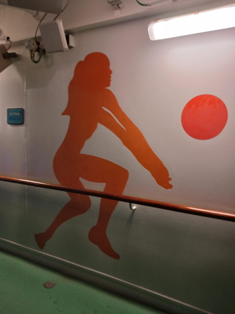
For starters, why are her arms shaped like clubs? We understand that volleyball requires you to have strong hands, but this is just wrong. Even worse is the fact that she looks like she has a hoof instead of a leg!